
All business owners know that appearances are incredibly important when it comes to the success of your company. Here at Pro 1 Painters, our commercial painters know that using the best exterior paint is crucial to achieving the look you desire. It is important to note, however, that the paint color also plays an extremely important role. Today we will discuss four paint colors to absolutely avoid when it comes to the exterior of your business. These colors have tested poorly time and time again, so when the time comes for a new coat of paint, remember this!
How do you choose the best exterior paint color for a storefront?
If you are struggling to choose the best paint for the outside of your business, our professional painters are always willing to offer an opinion! Some colors work better than others for your commercial space. Here are the four colors you should avoid:
#1 – Yellow
It has been discovered that many people don’t like the color yellow. So, if you’re trying to entice new customers to visit your commercial space, yellow may turn them away! While yellow can be used nicely as an accent color inside your space, on the outside it should be avoided. If there is yellow in your logo, limit the outdoor use to your signage.
#2 – Black
Black can be expertly used in a modern setting, but it should not be overdone. A nice black and white combination can give a sharp look to your business; however, the white should be accentuated. Not only is white fresh and inviting, but it is also easy to keep it looking sharp with regular pressure-washing.
#3 – Red
Red is a color that can cause stress and anger. It also can be harsh on the eye. Any shades of red or pink should be altogether avoided, as they are not sophisticated and most likely won’t invite new customers to your business.
#4 – Green
Light green can be used to create a calm, welcoming environment, but other shades of green should be avoided. Olive green and lime green are not pleasant to look at and would not invite new customers. If you are using light green, be sure to accent it with a nice contrast like a navy blue or a crisp white.
Trust Our Exterior Painters
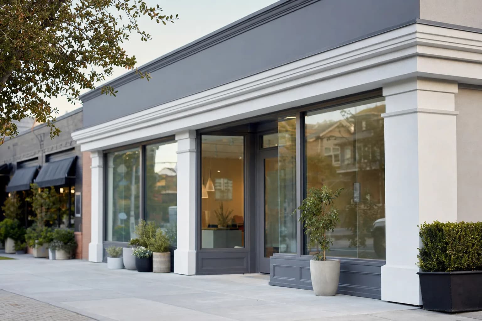
So what do we recommend? Grays, whites and creams, and blues all create excellent backgrounds for a variety of logos. They will make your business look sophisticated and polished. This could definitely have a positive effect on your profits.
Whatever color you decide, our experts will refresh and transform your commercial space. When you hire Pro 1 Painters, you are hiring professionals with the highest standards for quality. Before any painting project, we will listen to exactly what you are looking for. We will make note of your budget as well as when you would like the project completed. It is our goal to consistently complete our projects on time and under budget.
We paint storefronts and commercial buildings throughout Mobile, AL and the wider Gulf Coast — from the historic facades along the Government Street historic corridor and the shops near Midtown and Oakleigh Garden to newer retail out toward West Mobile. One thing we factor in across Mobile County: the humid Mobile Bay air fades bold and dark colors faster, which is one more reason the grays, whites, creams, and blues we recommend tend to hold their look longer here. Browse recent work on our commercial painting and exterior painting pages, or reach out for a free estimate.