
Picking one color for your whole house sounds like the easy way out. It's actually the smart way in. One well-chosen neutral on every wall is the most cohesive, lowest-risk repaint there is — it makes rooms flow into each other, it never fights your floors, and it lets your furniture and art carry the personality instead of five clashing wall colors. The hard part isn't going one color. It's picking the one color, because the same paint can look like three different colors as it moves from your north-facing bedroom to your sun-soaked kitchen.
Here's how to choose a single whole-house wall color you won't regret, the neutrals that travel best room to room, and where to add interest so "one color" never means boring.
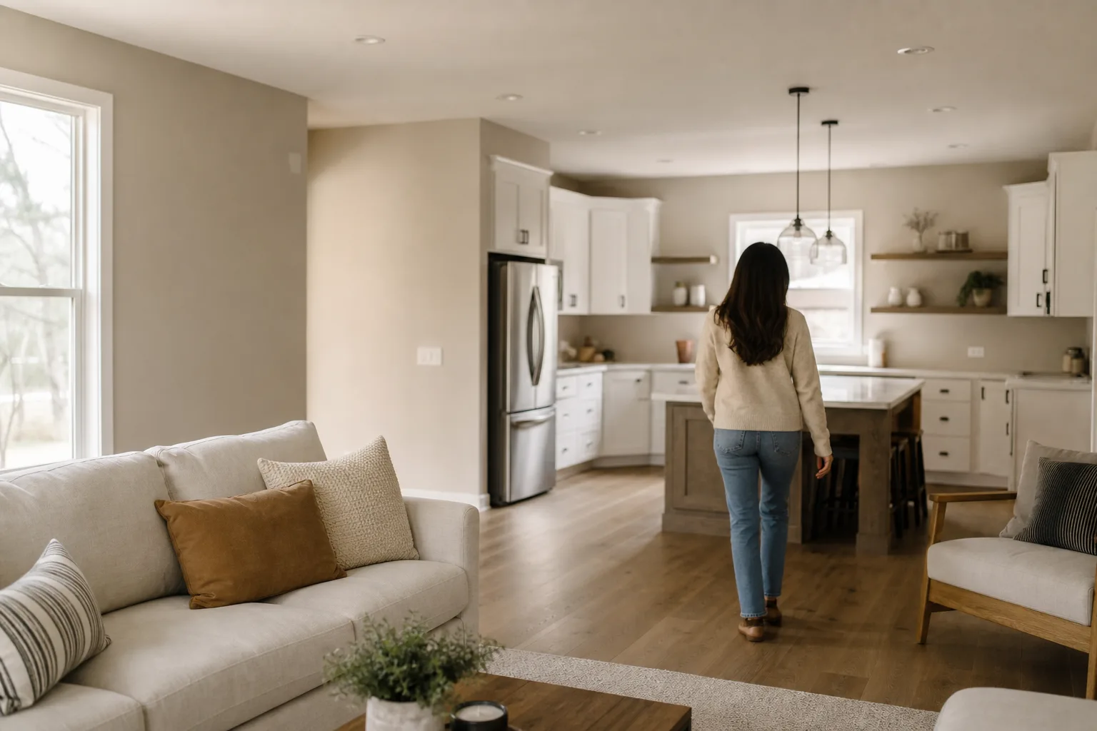
Why one paint color for the whole house works
A single wall color throughout the home does three things at once. It creates flow — your eye moves through the house without stopping at a color change in every doorway, which makes the whole place feel larger and calmer. It removes risk — you're committing to one undertone instead of trying to make five separate decisions agree with each other. And it simplifies everything downstream, from touch-ups years later to deciding what art goes where.
It's also the most forgiving approach for an open floor plan, where the kitchen, dining, and living space are all in one sightline. When those zones share one wall color, the room reads as one room. If you've got a true open-concept layout and you're weighing one color versus a flowing multi-color palette, our guide to whole-home color flow for open floor plans walks through the multi-color version — this post is the case for keeping it to one.
How do you choose one color when light changes everything?
Here's the thing nobody tells you until you've already painted: a color does not look the same in every room. The same neutral reads noticeably warmer in a south-facing room that gets strong afternoon light, and cooler — sometimes grayer or even slightly purple — in a north-facing room that gets soft, indirect light. East rooms warm up in the morning, west rooms in the evening. Your flooring throws color up onto the walls too, and your light bulbs nudge everything warm or cool after dark.
That's why the single most important step in choosing one whole-house color is testing it in several rooms, not one. Paint a big sample — at least two feet square — on walls in your brightest room, your darkest room, and a couple in between. Then look at all of them in the morning, in the afternoon, and at night under your own lighting.
Start with your fixed elements
Look at your flooring, big furniture, and stone or tile. They're staying — so pick a wall color that works with their undertones instead of fighting them.Sample three to five candidates
Choose a short list of forgiving neutrals. Get sample pots — not just paint chips, which are too small and lie about the real color.Paint big swatches in multiple rooms
Brush two-foot squares on walls in your brightest and darkest rooms and a few in between. A chip by the window won't show you how it travels.Watch them across a full day
Check every swatch in morning, afternoon, and evening light, including your own bulbs at night. The winner is the one that still looks good in the worst room.Commit, then plan the accents
Once a neutral holds up everywhere, lock it in for the walls and decide where trim, ceilings, and one or two accents add the contrast.
For Gulf Coast homes specifically, lean a touch warmer than you think you need. Our strong, bright southern light can wash a cool gray out to a flat, hospital-looking tone, while a warm greige or a creamy off-white stays inviting. The undertone matters more than the name on the can.
The most forgiving whole-house neutrals
The colors that travel best from room to room are warm neutrals with a quiet undertone — they bend with the light instead of flipping on you. A few families that consistently work as a single whole-home color:
| Color family | Why it travels well | Best for |
|---|---|---|
| Warm greige | Reads soft and balanced in both north and south light; the safest all-rounder | Most homes, open floor plans, resale |
| Creamy off-white | Bright and airy without going stark; flatters warm floors and trim | Light-filled homes, cottages, smaller rooms |
| Soft warm gray | Modern and calm; needs enough natural light so it doesn't go flat | Bright, larger rooms with good window light |
| Warm white | Crisp but not cold; the most flexible backdrop for art and furniture | Galleries of family photos, lots of natural light |
Notice the word "warm" keeps showing up. For our climate and light, that's not an accident. Cool, true grays were everywhere a few years back and they read dated and chilly in southern sun. A neutral with a warm base is the more timeless single color for a whole house, and it's far kinder to the strong light we get here. If you want help comparing specific colors against your floors and finishes, that's exactly what a color consultation is for.
Where to add interest when every wall is one color
One color on the walls does not mean a flat, monotonous house. The contrast just comes from somewhere smarter than five paint colors. Here's where to put it:
- Trim. A crisp white trim a shade or two off your wall color adds the definition that keeps rooms from looking washed out. Most one-color homes still use a distinct trim color. If you're tempted to paint trim and walls the same color for a soft, seamless look, that's a real option too — just a different one, and worth seeing both ways first.
- Ceilings. Keep ceilings a brighter white to lift the room and bounce light. You can carry the wall color overhead in a bedroom or study for a cozy, enveloping feel, but a bright ceiling over one wall color is the most forgiving combination.
- Sheen. Same color, different sheen, different effect — a satin or eggshell on the walls with a semi-gloss on the trim creates subtle contrast and a more durable, scrubbable surface where you need it.
- One or two accent moments. A bold front door, a moody powder room, a single feature wall behind the bed. Pick a couple of spots to break the rule on purpose. Against a calm whole-home neutral, those moments actually land.
- Texture and furnishings. Your rugs, art, plants, and pillows carry enormous visual weight. A neutral backdrop is what lets them stand out instead of competing.
The whole point of one wall color throughout the home is a quiet, cohesive canvas. The interest comes from contrast you control, not from a different color in every room.
When you're ready to take a whole-house color from "maybe" to a written plan, the move is a free in-home estimate. We'll look at your light and your floors, talk through the one-color approach and where to add accents, and hand you a written quote within 24 hours for your interior painting project. Every Pro 1 job runs with one accountable crew from that first estimate to the final inspection, a clean job-site each day, and a manager sign-off before final payment — backed by our 3-year workmanship warranty and a 4.8-star rating from homeowners across the Gulf Coast.