
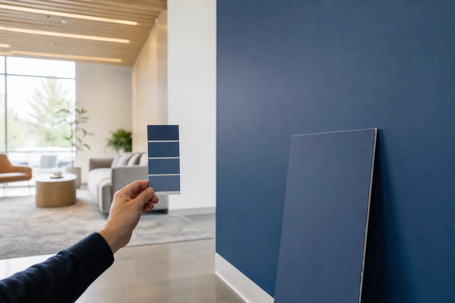
You hand a painter your brand color — the exact blue that's on your sign, your trucks, your website — and a week later the lobby wall is close, but not it. A shade too purple. A touch too dark under the LEDs. For a business, "close" on a brand color isn't close enough; that wall is your brand, sitting in front of every customer who walks in. Brand color matching for commercial painting is the craft of getting your real color onto the wall and keeping it consistent — across every wall, location, and touch-up down the road. Here's how it actually works, and where it goes wrong.
This is one piece of a commercial repaint. For the full picture of how a job gets scoped, scheduled, and run, see our commercial painting guide for Mobile and Baldwin County. Here we're zeroing in on one deceptively hard thing: nailing your exact color.
Why your brand color shifts from screen to wall
Answer-first: the same color never lands identically on a screen, in print, and on a wall, because each one makes color a different way. Understanding that is the whole reason matching takes more than typing in a number.
Your monitor builds color with emitted light — red, green, and blue pixels glowing (RGB). Your printed signage builds it by absorbing light with inks (CMYK, or a Pantone spot color). A painted wall builds it a third way: pigment reflecting room light back at your eye. A "hex code" lives in the screen world; a "PMS number" lives in the ink world; paint lives in neither. So translating any of them straight to a can of paint is always an approximation, not a copy. That gap — not sloppy work — is why a color that looked perfect on your laptop can feel off on drywall.
Match to something you can hold, not a screen
So the single most useful thing you can bring us is a physical sample of the real color: a piece of your printed signage, a branded panel, a swatch from your sign shop, even a product in your brand color. Match to the thing customers actually see, and the screen-versus-print problem disappears — we're chasing pigment with pigment.
From there, a modern color match starts with an instrument read of your sample to get a paint formula in the ballpark fast. But the instrument gets us close, not done. The last bit is a painter's eye: we adjust the tint and look at it under the lighting your wall will actually live in, because that's where the color has to be right. A Pantone chip is great. A printed sample is better. Both beat a hex code emailed over.
How do we lock your color in?
Getting the color right once is half the job. Making it repeatable is the other half. Here's the process we run.
1. Start from your real spec
We gather your brand standards — Pantone, CMYK, hex — plus any physical sample like printed signage or a branded panel, so we're matching the source instead of a guess.2. Match to a physical sample
We match against a printed or painted sample under the lighting it'll live in, because a glowing screen never lands the same as pigment on a wall.3. Read it, then tune by eye
A color-matching read gets the formula close; then we adjust by eye under your actual lighting until the drawdown matches the brand.4. Approve a large drawdown on site
We paint a big sample board in the real product and sheen, set it on the wall, and get your sign-off before committing the whole job.5. Write the formula into a spec
We record the exact tint formula, product, and sheen so the color is repeatable for touch-ups and the next location.
That fourth step matters more than people expect. A tiny store chip can't tell you how a color reads at full scale — bold colors especially intensify across a big wall. So we paint a large drawdown in the exact product and sheen, stand it up in your space under your lights, and you approve that. What you sign off on is what goes up. And once it's approved, we don't keep it in our heads: the formula, product, and sheen get written into a spec sheet.
Lighting and sheen change everything
Two things will make a perfectly matched color look wrong if you ignore them: the light and the sheen.
Light first. The same paint reads differently under warm incandescent, cool retail LEDs, and north-facing daylight — a phenomenon called metamerism, where two colors match under one light and diverge under another. A brand color approved under the paint store's fluorescents can look like a different color in your sunlit lobby. So we always approve the match under the lighting the wall will actually live in. If a space mixes daylight and artificial light, we check it under both.
Sheen second. Flat, satin, and semi-gloss of the same color don't look the same, because gloss bounces more light back and can make a color read lighter or more saturated. A logo wall in semi-gloss and a corridor in eggshell won't match even with an identical tint. So we match and approve in the exact sheen the job will use. Want to test how a color feels in your space before you commit to a drawdown? Our free AI Color Visualizer lets you upload a photo of the actual room and preview colors on it — a useful gut-check before we paint the real sample board. And if you're still narrowing down the palette around your brand color, a color consultation is built for exactly that.
Keeping the color consistent across locations
For a multi-site business, the real prize is consistency: your color looking the same in store number three as it does in store one. This is exactly what the written spec buys you. Because we recorded the precise tint formula, product, and sheen, every location gets painted from the same recipe instead of being re-matched from scratch — which is how brand colors quietly drift from site to site. Same formula, same product line, same sheen, approved once under representative lighting, repeated everywhere. That's also what makes future touch-ups invisible: a year later, the patch is mixed from the same spec, not eyeballed to a faded wall. When a brand color match is part of a wider update, our guide on a commercial color scheme and brand refresh walks through coordinating the whole palette, not just the one signature hue.
The bottom line on matching your brand color
Brand color matching for commercial painting is part science, part craftsman's eye. The science is knowing that screen, print, and paint are three different color worlds, so you match to a physical sample, not a number. The craft is tuning the formula under real lighting, approving a full-size drawdown in the right sheen, and writing the recipe down so it repeats. Do that and your brand color lands true on the wall and stays true across every location and every touch-up.
That's how we handle color on every commercial job — family-owned since 2013, one accountable crew from your free estimate through the final inspection, all backed by our 1-year workmanship warranty. If you need your exact brand color on the walls of a store, office, or multiple locations, see our commercial painting service or book a free estimate and a written quote within 24 hours. Pay by Cash, Check, or Credit Card.