
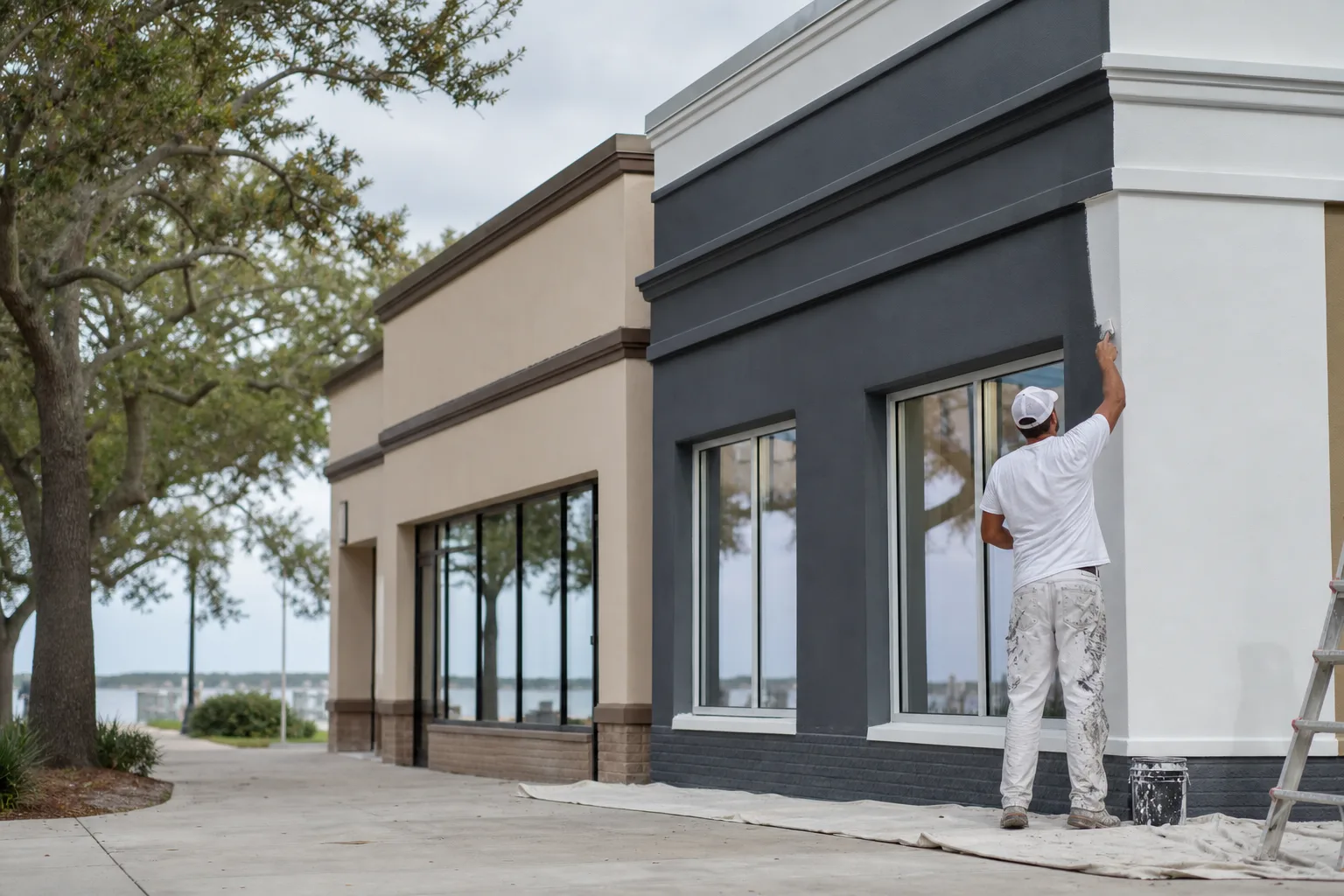
Drive any Gulf Coast commercial strip and you can pick out the buildings that haven't been touched in fifteen years. Faded mauve. Hunter green that read as upscale in 2005. A body color that's gone chalky and uneven under the Alabama sun. The business inside might be thriving — but the building is telling customers something older and tireder than the truth. A commercial color scheme refresh fixes that gap: it brings the outside of your business back in line with who you are now, and it does it in a way that reads from the road.
This isn't about matching your logo to the inch — that's a separate, more technical job we cover in our guide to brand color matching for commercial painting. This post is about the design decision before that: choosing a refreshed scheme that modernizes your curb appeal, keeps your identity, and survives the climate. For the full picture of how a commercial repaint gets scoped and run, start with our commercial painting guide for Mobile and Baldwin County.
When is a commercial color scheme overdue for a refresh?
Answer-first: if your building's colors are fighting your brand, looking dated, or visibly faded, it's time. A few honest signs:
- The palette is out of style. Color trends move slower on buildings than in fashion, but they move. Heavy earth tones, dusty pastels, and high-contrast 90s combos date a storefront fast.
- The color has faded unevenly. Gulf Coast sun is brutal on saturated colors. A south- or west-facing wall that's gone patchy or chalky reads as neglect even if the business is sharp.
- You've rebranded, but the building hasn't. New logo, new signage, new interior — and an exterior still wearing the old company's colors. The mismatch confuses people pulling in.
- The colors don't read from the road. If a passing driver can't quickly register "that's the building," the scheme is working against you.
The three-color rule for commercial buildings
Most commercial exteriors that look sharp follow the same simple structure: a dominant body color, a secondary trim color, and one accent. It keeps the building from looking either flat or chaotic.
| Role | What it does | Where it lives |
|---|---|---|
| Body (dominant) | Sets the overall tone — usually the safest, most timeless choice | The bulk of the walls |
| Secondary (trim) | Defines edges and architecture, adds contrast and crispness | Trim, fascia, columns, window frames |
| Accent (brand) | Carries your identity and draws the eye to the entrance | Entry, doors, sign band, awnings |
The move that makes a refresh feel modern without throwing away your brand: modernize the body and trim, keep your signature color as the accent. Swap a tired beige body for a clean warm white or a confident charcoal, sharpen the trim — then let your recognizable brand color live on the entry and sign band where it does the most work. The building reads new; your customers still recognize you.
Designing a refresh that survives the Gulf Coast
A scheme that looks great on day one but fades in two years isn't a refresh — it's a do-over waiting to happen. The climate has to be part of the design conversation, not an afterthought.
Saturated, very dark colors take the worst of the Alabama sun. Deep reds, navies, and bold brand hues hold their punch for a while, then start to chalk and shift on the sun-facing walls first. That doesn't mean you can't use a bold brand color — it means you're smart to carry it as an accent on a smaller, often shaded surface like an entry or a covered sign band, and to spec a fade-resistant, UV-stable product for it. The big body walls, taking the most sun and the most square footage, are where mid-tone and lighter colors earn their keep: they fade more gracefully and keep the building looking maintained years longer.
The finish matters too. A flat sheen hides surface flaws on an older masonry or stucco wall but holds less up to washing; a satin on trim and doors wipes clean and pops the accent. Matching sheen to surface and exposure is part of getting a refresh that still looks intentional after a few coastal summers — and it's worth talking through at the estimate.
See it on your building before you commit
The hardest part of a color refresh is picturing it. A two-inch chip on a counter tells you almost nothing about how a color reads across a full facade in coastal light. So before we paint anything, react to the colors on your actual building.
Our free AI Color Visualizer lets you upload a photo of your storefront or building and preview color combinations right on it — body, trim, and accent — so you can see a refresh on your own walls instead of imagining it. It's the fastest way to narrow a dozen ideas down to two or three worth testing for real. And if you'd rather have a hand pulling a cohesive scheme together from the start, a commercial color consultation is built for exactly that: matching a refreshed palette to your brand, your building, and the way Gulf Coast light actually falls on it.
The bottom line on refreshing your commercial color scheme
A commercial color scheme refresh is one of the highest-return things you can do to the outside of your business. Keep the structure simple — body, trim, one brand accent — modernize the body and trim while protecting your signature color, and choose colors and finishes that hold up to the Alabama sun so the refresh still looks fresh in a few years. Get those right and your building finally reads as current as the business inside it.
That's how we approach every commercial refresh — family-owned since 2013, one accountable crew from your free estimate through the final inspection, all backed by our 1-year workmanship warranty. If your building's colors are overdue for a rethink, see our commercial painting service or reach out for a free estimate and a written quote within 24 hours. Pay by Cash, Check, or Credit Card.