
Open a search for "coastal paint colors" and you'll drown in bright nautical navy, crisp sailboat white, and a rope-and-anchor cliche that looks great in a catalog and tired in a real house by year two. The coastal palettes that actually hold up on the Gulf Coast are quieter than that. They're soft, a little grayed, and built to work with the bright, slightly warm light we get off Mobile Bay — not to shout "beach" at it.
Below are five coastal interior color palettes we reach for again and again on homes across Mobile and Baldwin County, each built from real Sherwin-Williams colors so you can take them straight to the store. They're grouped the way we actually use them: a main neutral, a trim white, and an accent or two in smaller doses. Pick the one that fits your light and your floors, and you've got a scheme you'll still love long after the trend cycle moves on. For the how behind picking colors for your specific rooms, pair this with our guide to choosing interior paint colors for a coastal home.
What makes a coastal palette actually work?
A coastal interior color palette works when it stays calm in bright light and reads as a related family, not a collection of one-off picks. Three rules carry every palette below, and they lean on the same temperature-and-saturation logic we cover in our guide to how paint color affects a room's mood.
First, lean muted. Slightly grayed colors — a softened white, a sandy neutral, a sea-glass green — feel coastal because they're easy in strong sun. Saturated brights bounce hard and tire fast. Second, let neutrals carry the walls and use color in doses: an accent wall, an island, the inside of a built-in, a powder room. Third, choose your white on purpose, because a coastal scheme lives or dies on its white.
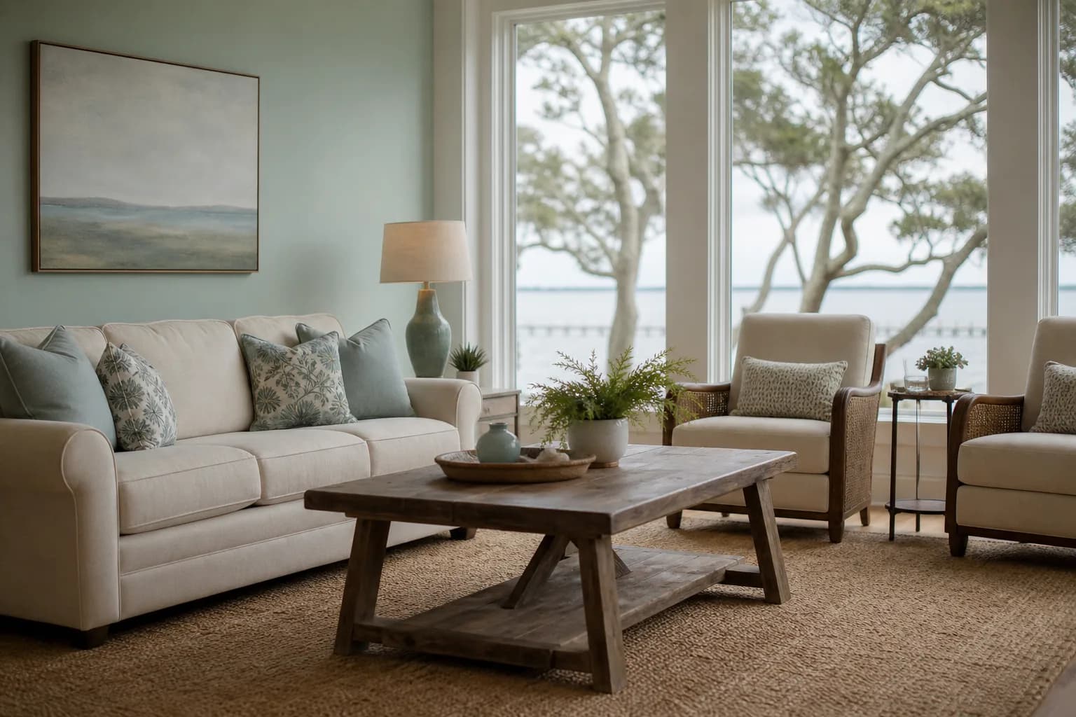
Palette 1 — Soft White + Sea Salt (the easy coastal classic)
This is the palette we recommend most for a first coastal home, because it's calm, forgiving, and hard to get wrong.
- Walls: Sherwin-Williams Alabaster — a soft, balanced white that doesn't go stark or yellow.
- Trim: Sherwin-Williams Pure White — clean and crisp against Alabaster without a hard contrast.
- Accent: Sherwin-Williams Sea Salt — a muted green-blue for a powder room, a study, or built-ins.
Sea Salt is the color people mean when they say "coastal but not themey." It shifts gently between green and blue depending on your light, which keeps it interesting room to room. Keep it off the big bright walls and use it where a room closes off — it glows in softer, north-facing light.
Palette 2 — Sandy Greige + Sea-Glass (warm and grounded)
If your floors lean warm — honey oak, travertine, a tan tile — a cool white-and-blue scheme can fight them. This warmer palette settles right in.
- Walls: Sherwin-Williams Accessible Beige — a sandy greige that bridges warm floors and cool accents.
- Trim: Sherwin-Williams Alabaster — a soft white that's warm enough not to clash with the beige.
- Accent: Sherwin-Williams Rainwashed — a pale sea-glass green-blue, a touch cooler than Sea Salt.
Accessible Beige is one of the most reliable neutrals we use on the coast because it carries warmth without going gold in the afternoon sun. Pair it with Rainwashed on a kitchen island or a bedroom accent wall and you get the sand-and-sea-glass feeling without a single literal beach motif.
| Palette | Main wall | Best for |
|---|---|---|
| Soft White + Sea Salt | Alabaster | Bright, open rooms; first coastal home |
| Sandy Greige + Sea-Glass | Accessible Beige | Warm floors; cozy, grounded feel |
| Bay Blue + Crisp White | Pure White (walls) / Naval (accent) | Bold accent rooms; offices, islands |
| Driftwood Neutral | Agreeable Gray | Whole-home flow; resale-friendly |
| Pale Sky + Sand | Sea Salt (walls) | Bedrooms, sunrooms, airy retreats |
Palette 3 — Bay Blue + Crisp White (color with a backbone)
Want real color, not just a hint? This is the one — but the trick is dosing the blue, not drowning in it.
- Walls: Sherwin-Williams Pure White — a clean backdrop that lets the blue do the talking.
- Accent: Sherwin-Williams Naval — a deep, handsome navy for an island, a built-in, or one wall.
- Soft support: Sherwin-Williams Atmospheric — an airy light blue for an adjoining room so the navy has a relative.
Naval is gorgeous on a kitchen island or a home-office accent wall against crisp white trim. Wrap a whole bright living room in it, though, and a sunny coast room turns cave-like. Keep the navy to roughly one surface per space and let white carry the rest. This is exactly the kind of choice we'd test on your real walls first.
Palette 4 — Driftwood Neutral (the whole-home flow pick)
When the goal is one calm palette that flows through an open floor plan and shows beautifully at resale, we go quiet and consistent.
- Walls: Sherwin-Williams Agreeable Gray — the do-everything warm greige that flexes warm or cool with the light.
- Trim: Sherwin-Williams Pure White — keeps the architecture crisp without stark contrast.
- Accent: Sherwin-Williams Sea Salt or Comfort Gray — a muted green-blue for the rooms that close off.
Agreeable Gray earns its name. It's neutral enough to carry every connected space — living room, hallway, kitchen — so the eye glides instead of hitting a hard color change at each doorway. That whole-home consistency is the single biggest thing that makes a coastal home feel finished rather than choppy.
Palette 5 — Pale Sky + Sand (the airy bedroom retreat)
For bedrooms, sunrooms, and a Bay-facing space you want to feel like a deep breath, put the soft color on the walls and keep everything else light.
- Walls: Sherwin-Williams Sea Salt — soft enough to live with all day, with a gentle green-blue calm.
- Trim: Sherwin-Williams Alabaster — a warm soft white that keeps Sea Salt from reading cold.
- Accent: Sherwin-Williams Accessible Beige — a sandy neutral on a headboard wall or in textiles.
Sea Salt on the walls of a north- or east-facing bedroom is one of our favorite coastal moves. The softer light keeps it serene instead of washed out, and the sandy Alabaster-and-Accessible-Beige supporting cast keeps the whole room grounded. If the bedroom is the room you most want to get right, our roundup of the best bedroom paint colors for relaxation digs deeper into restful picks.
How to pick the right palette for your light
The same palette can look like two different schemes depending on which way your windows face — so test before you commit.
Note your light direction
South- and west-facing rooms get intense, warm Gulf sun; north- and east-facing rooms get softer, cooler light. That decides whether your white and blue lean warm or cool.Preview the palette on your photo
Use our free AI Color Visualizer to upload a photo of the actual room and see the palette on your real walls before you spend a dime on samples.Sample big, then live with it
Brush two-foot swatches of your top picks on the wall and watch them morning, midday, and evening for a couple of days before you decide.Settle sheen with color
Choose matte or eggshell for most walls, satin or semi-gloss in wet and high-traffic rooms; sheen changes how every coastal color reads.
Before you buy a single sample, see the palette on your own walls: our free AI Color Visualizer lets you upload a room photo and preview real colors on it, so you narrow the list fast. When you're close, a short color consultation helps you lock the undertones and the flow for your specific light — the step that keeps you from repainting a color you talked yourself into.
The bottom line
A coastal interior color palette that actually works isn't about copying a beach-house photo. It's a tight family of muted, sun-friendly colors — a soft white, a sandy neutral, and a sea-glass blue or green used in doses — chosen for your light and your floors. Any of the five palettes above will get you there on a Gulf Coast home.
When you're ready to put one on the walls, we're a family-owned crew that's painted homes across Mobile and Baldwin County since 2013, and we'll help you get the color right the first time. Start with our interior painting page or grab a free in-home estimate — we'll bring a written quote within 24 hours and back the work with our 3-year workmanship warranty.