
Two rooms, same size, same furniture, painted two different colors — and they feel like different houses. One wraps you in a soft, quiet calm; the other hums with energy the second you walk in. That's not your imagination, and it's not magic. It's color doing what color does: shaping how a space feels before you've consciously thought about it. Color psychology is the practical side of that effect — understanding why a color reads calming or energizing so you can pick one that matches how you actually live in a room, instead of repainting in six months because the walls feel "off."
You don't need a design degree to use it. A few reliable principles cover most of it, and the biggest one is simpler than people expect: a color's temperature and its saturation do most of the mood-setting work. Here's how that plays out room by room.
How does paint color affect a room's mood?
Color shapes mood through two levers more than any other: temperature and saturation. Temperature is whether a color leans warm (reds, oranges, yellows) or cool (blues, greens, soft grays). Saturation is how intense or muted it is — a clear, full-strength teal versus a soft, grayed-down sage. Get those two right for the room and the exact hue matters far less than you'd think.
Warm colors advance toward you and tend to feel energizing, cozy, and sociable. Cool colors recede and tend to feel calm, restful, and open. Saturation turns the volume up or down: a deeply saturated color makes a strong statement and can feel intense over a whole room, while a soft, muted version of the same color is gentle and easy to live with for years. Most rooms that feel "wrong" got the temperature or the saturation wrong — too cold where you wanted cozy, or too loud where you wanted rest.
| Color family | Mood it tends to set | Rooms it suits |
|---|---|---|
| Warm reds / terracotta | Energizing, intimate, appetite-friendly | Dining rooms, social kitchens, accent walls |
| Warm yellows | Cheerful, bright, uplifting | Kitchens, breakfast nooks, playrooms |
| Cool blues | Calm, restful, lowers visual energy | Bedrooms, bathrooms, studies |
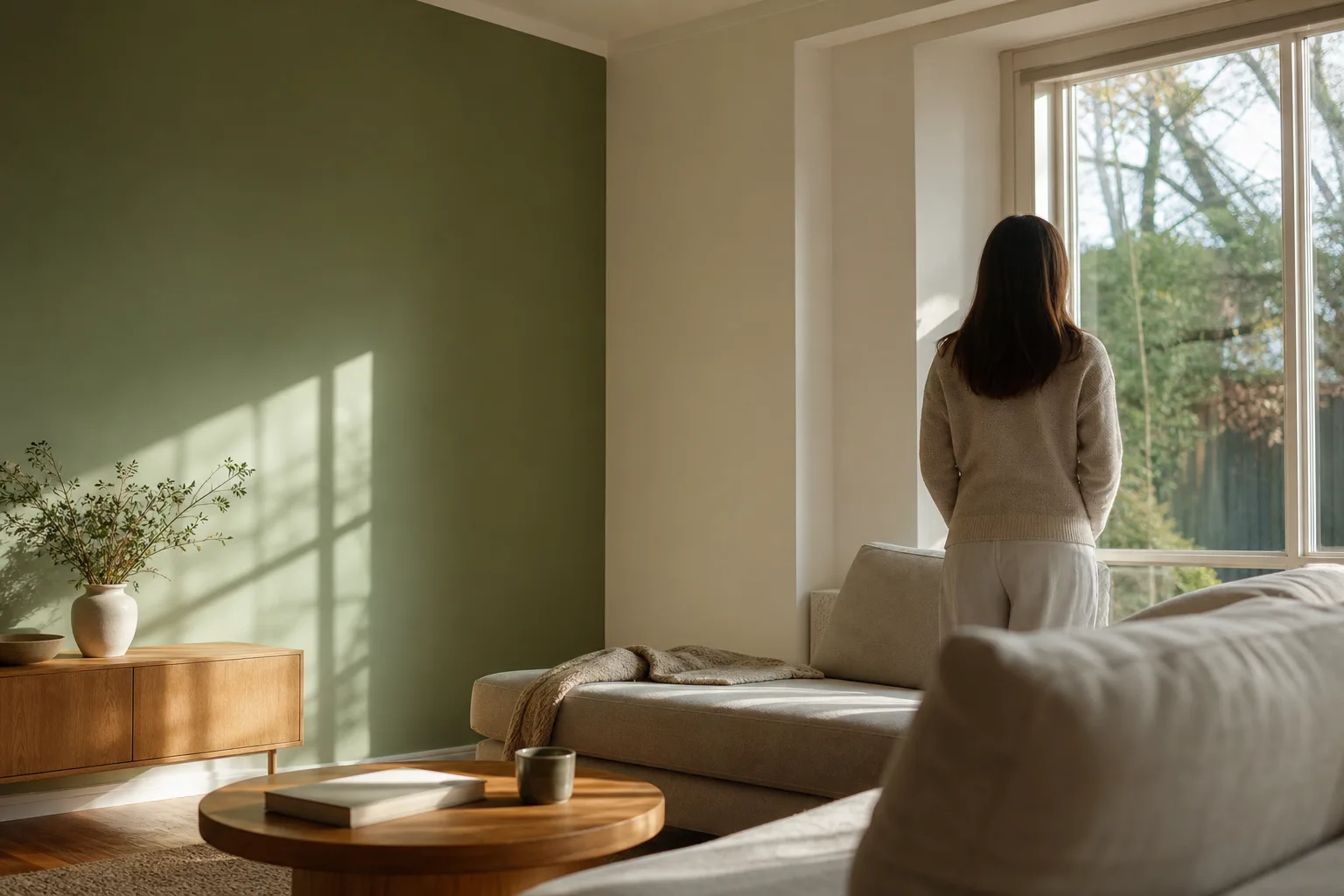
| Greens (cool-leaning) | Balanced, grounded, restorative | Living rooms, bedrooms, home offices |
| Soft neutrals / greige | Quiet, flexible, low-stimulation | Anywhere you want calm and longevity |
Cool colors for the rooms where you rest
If a room's job is to help you wind down, lean cool and keep the saturation low. Soft blues, sage and other muted greens, and warm-leaning neutrals lower the visual energy of a space — there's simply less for your eye to react to — which is why they're the go-to for bedrooms and bathrooms. The trick is muted. A bright, fully saturated blue can read cold and clinical; a softened, grayed version of the same blue reads serene. The hue gets the credit, but the saturation does the work.
Greens deserve a special mention because they sit between warm and cool and tend to feel grounded and restorative — easy to live with in a bedroom, a living room, or a home office. For the room where calm matters most, our guide to the best bedroom paint colors for relaxation goes deeper on specific picks, and the broader interior house painting guide for Mobile and Baldwin County ties color choice into a whole-home plan.
Warm colors for the rooms that come alive
Where a room is built for activity and gathering, warm colors earn their keep. Clear yellows feel cheerful and bright in a kitchen or breakfast nook. Terracotta and other warm oranges feel cozy and grounded. Warm reds raise the energy and are a long-standing dining-room choice because they read intimate and sociable. The catch is intensity: a saturated warm color on all four walls can be a lot to live with, so many people get the lift they want by using it as an accent — one wall, an alcove, or the back of a built-in — while the rest of the room stays calmer.
That accent approach is one of the most reliable ways to inject mood without overwhelming a space. If that's the direction you're leaning, our post on where accent walls actually work covers the placements that look intentional instead of dated.
Saturation and darkness: the dials people forget
Most people argue about hue when the bigger mood levers are saturation and value (how light or dark a color is). A pale, washed sky-blue and a deep navy are both "blue," but one floats and one anchors. Light, low-saturation colors open a room up and keep it airy; deep, saturated colors pull the walls in and make a space feel cozier and more enclosed. Neither is better — a moody, dark study or dining room can feel rich and grounded on purpose, while a small low-light room often wants something lighter to keep from feeling closed in.
The point is to choose the effect deliberately. "This room feels small and dark" is only a problem if you wanted airy; if you wanted cocooning, it's a win.
There's a finish angle here too, not just a color one. The same color in a flat sheen reads softer and more muted, while a satin or semi-gloss bounces more light and can make a hue feel a notch brighter and more saturated. So a color you found a touch too quiet can be nudged up with a livelier sheen, and a color that felt slightly intense can be calmed with a flatter one — without changing the color at all. It's one more reason the chip in your hand only tells part of the story.
Let the room's light have the final say
Color psychology gives you the starting direction, but a room's natural light makes the final call. The same color reads cooler in a north-facing room, warmer in a sun-filled south room, and changes again at night under artificial light — which is why a color that looked perfect on a card can feel wrong once it's up. Test your top picks in the actual room, at the times of day you actually use it, before you commit.
The easiest way to do that without painting sample patches everywhere: snap a photo of your room and preview real paint colors on your own walls with our free AI Color Visualizer, then narrow it down before a single can is opened. For coastal homes specifically, our coastal interior color palettes that actually work is a good next read.
Choose for the feeling, then live with it for years
Color psychology comes down to this: decide how you want a room to feel, match the temperature and saturation to that feeling, and judge the color in the room's real light. Cool and muted for rest, warm and lively for the social rooms, and the saturation dial set on purpose either way.
When you want a second set of eyes, that's exactly what our color consultation is for — we help you land a palette you'll still love in two years, then bring it to life. Pro 1 Painters is a family-owned crew, and one accountable crew handles your interior painting from the free estimate to the final inspection, backed by our 3-year workmanship warranty. When you're ready, call us for a free in-home estimate and a written quote within 24 hours.