
Drive Old Dauphin Way at golden hour and the street does the selling for itself — deep porches, gingerbread trim, and a century of architecture under the live oaks. The homes that look right aren't the ones with the boldest color. They're the ones whose color fits the house. Get the palette wrong and even a beautiful Victorian looks costumed; get it right and the original details snap back into focus.
Choosing Old Dauphin Way exterior paint colors is part history, part craft. Here's how to land a scheme that honors the house, holds up to the Gulf-Coast climate, and clears the rules of Mobile's largest historic district.
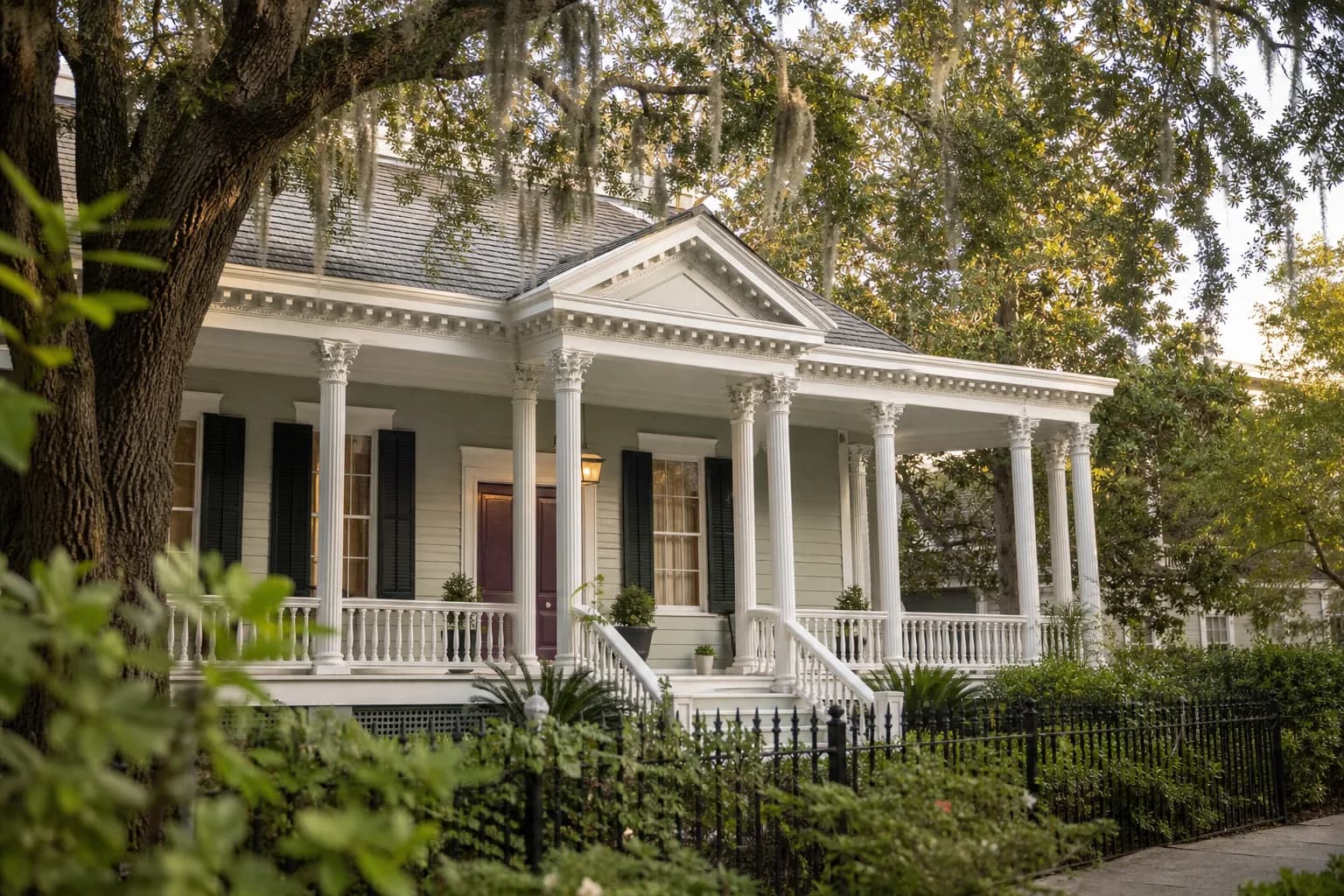
Which palette fits the era of your house?
Old Dauphin Way spans decades of building styles, and the right palette depends on which one you own. A late-1800s Italianate wears color differently than a 1920s Craftsman bungalow. Before you fall for a swatch, identify your home's period and look at what was authentic to it.
| Home style | Palette that tends to fit |
|---|---|
| Italianate / Victorian | Muted earth tones — olive, ochre, deep red-brown — with darker trim and a rich accent |
| Queen Anne | Layered scheme: a mid-tone body, two trim colors, and a saturated door or sash |
| Craftsman bungalow | Warm naturals — sage, putty, brown — with cream trim and a stained or deep front door |
| Colonial Revival | Soft historic neutrals with bright white trim and a classic black or deep-blue door |
This isn't about freezing your house in amber. It's about choosing within a family of colors that lets the architecture read the way it was designed to. A common mistake is treating a historic home like a new build and reaching for the crisp, high-contrast grays that look great on a modern infill house. On a Victorian or a turn-of-the-century cottage, those same colors can flatten the trim and make the whole facade feel a little cold. Period palettes lean warmer and softer for a reason — they were mixed to flatter wood, deep porches, and the kind of detailing these homes carry.
If you're not sure where to start, look at your fixed elements first. The roof, any exposed brick or stone on the foundation or chimney, and the porch decking aren't changing, so your color scheme has to live alongside them. A red-brick base, for instance, pushes you toward warmer body colors and away from cool blue-grays that would fight it.
Build the scheme: body, trim, and accent
Most historic exteriors read best as three coordinated colors, not one. Think of it as a hierarchy.
Pick the body color first
This is the largest surface and sets the mood. Lean toward a softer, slightly muted version of your color — full-saturation hues read louder outdoors than they do on a chip.Choose a trim that frames it
Trim outlines the windows, eaves, and porch. A crisp off-white or a tone a few steps from the body color makes the detailing pop without fighting it.Add one confident accent
Save the boldest color for the front door, shutters, or sash. One strong accent looks intentional; five scattered ones look busy.
A quick rule for this street: restraint reads as authentic. The grandest homes on Old Dauphin Way usually earn their drama from a single saturated accent against a calm body and clean trim — not from a six-color paint job.
Respect the historic district rules
Old Dauphin Way is a locally designated historic district, which means exterior changes — including color — can be subject to review. Before you settle on a scheme, check with the City of Mobile's Architectural Review Board about what's required for your block and your scope of work. It's far easier to confirm up front than to repaint after the fact. Keep documentation of any approved colors with your house records; it helps the next time, and it helps at resale.
Working within those guidelines isn't a limitation — it's part of what keeps the district looking like itself, which is a big reason these homes hold their value.
Color is only as good as the prep underneath it
The most beautiful palette fails fast if the surface isn't ready — and on a 100-year-old wood home, prep is most of the job. Prep is 80% of a paint job that lasts. On historic siding and trim we wash off chalk and grime, scrape failing paint back to a sound edge, treat any soft or rotted wood, and prime every bare spot before a drop of finish goes on. Old-growth wood and decades-old trim reward that patience.
It matters even more here because of the climate. Mobile sees roughly 52 inches of rain a year, July highs near 94°F, and humidity that never really lets up. That's hard on exterior paint, and it's why a job that skipped prep starts peeling in a couple of seasons. The body color you chose so carefully should still look right in year five — which comes down to the work under the finish, not the brand on the can. Our exterior painting service is built around that prep-first approach.
Putting your Old Dauphin Way palette together
Match the era, build a calm three-color scheme, confirm the district rules, and insist on real prep. Do those four things and your historic home will look like the best version of itself for years. The same approach carries across Mobile County's other historic neighborhoods — De Tonti Square, Oakleigh Garden, and Leinkauf all wear period palettes for the same reasons Old Dauphin Way does. For more on the district's architecture and approval process, see our guide to painting Mobile's National Register historic homes, and for the neighborhood at large, our Mobile exterior painting overview.
Pro 1 Painters is family-owned since 2013 with a 4.8-star Google rating, a Mobile office about 15 minutes from the district, and a 3-year workmanship warranty on our work. Ready to choose your colors? Call us for a free on-site estimate and a written quote within 24 hours. Pay by Cash, Check, or Credit Card.