
You picked the gray. It looked clean and modern on the chip, calm in the showroom, exactly right. Two coats later it's on the wall and there's a faint lavender cast in the morning and a hint of blue at night, and you're standing there wondering what happened to the color you chose. Nothing happened to it. You're just finally seeing its undertone — the quiet second color that was always in there, hiding under the one you noticed.
Undertones are the single biggest reason a paint color surprises people, and the good news is they're learnable. Once you know what an undertone is, why it shifts, and how to drag it into the open before you commit, you stop guessing and start choosing colors that look right on day one. This is a working painter's guide to reading warm, cool, and neutral paint undertones — and it's the skill behind almost every "why does my paint look different than the chip" question we get.
What is a paint undertone, actually?
A paint color has two layers working at once. The mass tone is the obvious color you name out loud — "gray," "white," "beige." The undertone is the subtle secondary color mixed underneath it, leaning the whole thing toward yellow, gold, green, blue, or violet. You rarely notice the undertone on a tiny chip in flat store light. You absolutely notice it once it's spread across a wall and your own light is hitting it.
Here's why it's there at all: very few paint colors are pure. A gray is built from black, white, and usually a touch of blue, green, or red to keep it from looking dead. A white gets warmed with a drop of yellow or cooled with a whisper of blue. Those tweaks are the undertone. They're what make a color feel like something instead of flat — and they're also what catch people off guard when the lean shows up bigger than expected.
Warm, cool, and neutral — what each lean does to a room
Undertones sort into three buckets, and each one changes how a finished room feels, not just how it looks.
- Warm undertones lean yellow, gold, orange, or red. They make a space feel cozy, inviting, and a little sunlit even on a gray day. Most "greige" and creamy colors live here.
- Cool undertones lean blue, green, or violet. They make a space feel crisp, fresh, and calm. A lot of modern grays and clean whites live here.
- Neutral undertones have almost no lean at all — true neutrals that don't pull warm or cool. They're genuinely rare. Most colors marketed as "neutral" are quietly warm or quietly cool, which is exactly why you can't trust the label and have to test.
There's no better lean — there's only the lean that fits your room. A warm undertone in a south-facing room flooded with Gulf sun can tip from cozy to yellow. A cool gray in a dim north room can slide from calm to cold. The trick isn't picking "warm" or "cool" in the abstract; it's matching the undertone to the light and the surfaces you already have. If you want help reading your own space, that's exactly what a color consultation is for.
Why undertones shift: light is the amplifier
A color is just the light a surface bounces back, so when the light changes, the undertone you see changes with it. Warm morning and evening light pushes warm undertones forward and can mute cool ones. Cool midday and north light does the opposite — it deepens blues, greens, and violets until a subtle cool lean becomes obvious. Artificial light piles on too: warm incandescent bulbs flatter warm colors, while cool daylight LEDs sharpen cool ones.
On the Gulf Coast this matters more than people expect. Our long, bright, often-hazy sun runs warm and intense for most of the day, so south- and west-facing rooms tend to push warm undertones harder and can wash pale colors out by afternoon. The same gray that reads cool and clean in a cooler climate can warm up noticeably in a sun-soaked Mobile or Baldwin County living room. Light is such a big lever that it deserves its own playbook — our guide on how natural light changes paint color in north- vs south-facing rooms digs into orientation specifically. For undertones, just hold onto the idea: the light is the amplifier, and the undertone is what gets amplified.
How to spot an undertone before you commit
This is the part that saves repaints. You don't need a trained eye — you need a method that forces the undertone to show itself.
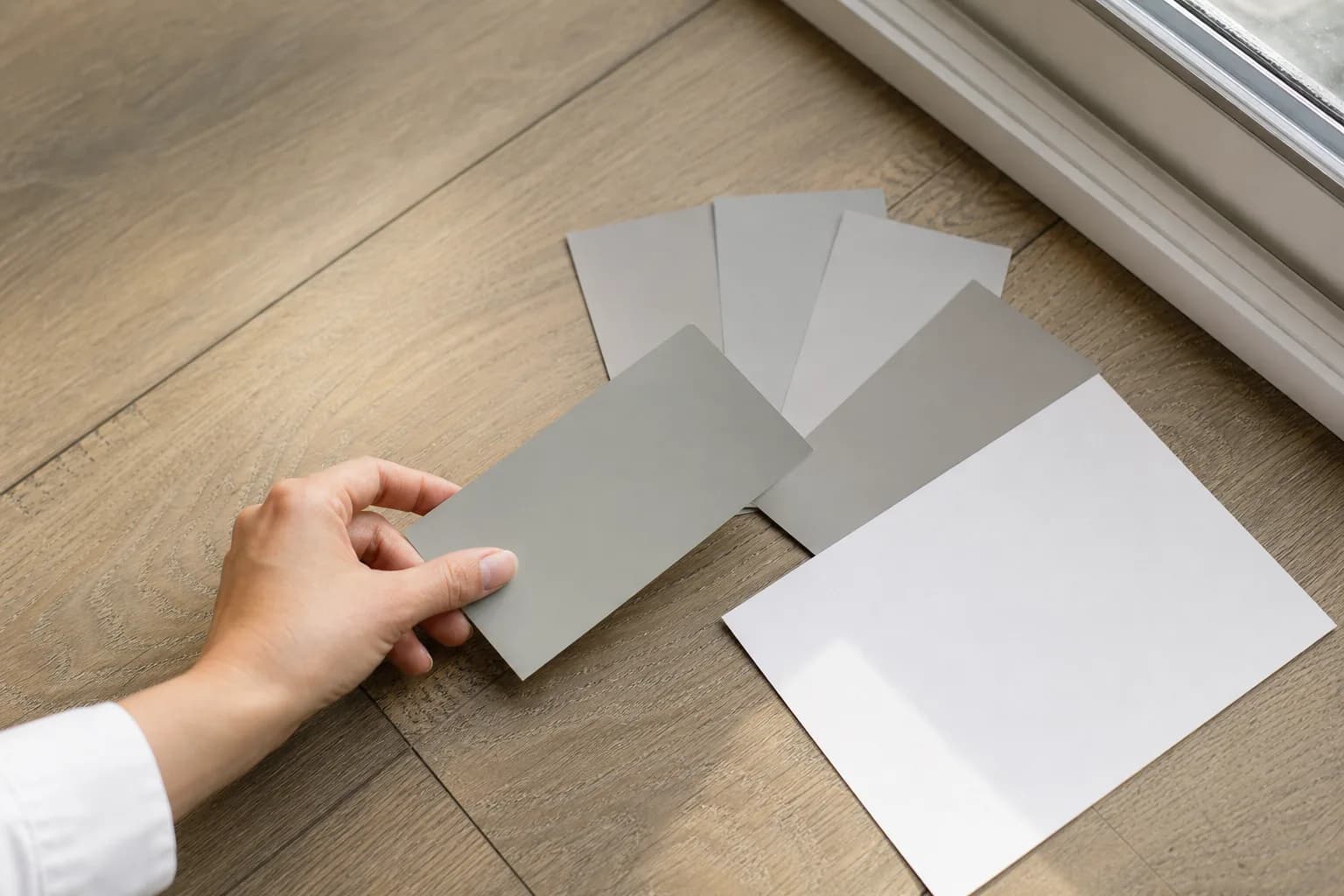
Compare against pure white
Set the chip next to a card of true, pure white. The white cancels out and any lean in your color jumps forward — suddenly the 'gray' reads visibly green or violet. This single trick exposes more undertones than anything else.Group the chip with its family
Lay your candidate next to three or four other colors in the same family. Against true grays, a greige looks warm; against beiges, the same chip looks gray. Seeing it in a lineup tells you which way it actually leans.Hold it against your fixed elements
Press the chip flat against the things you can't change — floors, countertops, tile, big furniture — because those have undertones too, and the wall color has to get along with them, not just look nice alone.Look in daylight and at night
Tape a big sample to the wall and check it in morning light, midday light, and under your bulbs at night. The undertone that shows up consistently, or shifts the most, is the one you'll live with.Trust the wall, not the chip
A 4x4 chip and a whole wall are not the same color experience — the undertone stacks up and intensifies at scale. Always judge from a large sample in the actual room before you commit to gallons.
A few patterns worth memorizing, because they trip people up constantly:
- Grays are the worst offenders. Because they're mixed from other colors, they almost always lean blue, green, or violet. The "purple gray" surprise is the classic — a cool gray under cool light.
- Whites lean too. A "warm white" carries yellow or cream; a "cool white" carries blue or gray. They look identical on the chip and completely different on the wall, which is why choosing between them is its own decision — our warm white vs cool white comparison walks through where each one belongs.
- Beiges and greiges usually lean warm, but a cool greige exists and can read almost gray. Match it to your wood tones, not your hopes.
Match the undertone to what you already own
Once you can see undertones, the choosing part gets simple: read your fixed elements first, then pick a wall color that leans the same direction. Your floors, counters, tile, and big furniture aren't going anywhere, and they all have undertones. Warm honey-oak floors want a warm or soft-neutral wall and will fight a cold gray. Cool gray-veined quartz wants a cooler wall. A red-toned brick fireplace pulls a whole room warm whether you planned on it or not.
You don't have to match colors — you match the lean. A warm wall and a warm floor in different colors still feel like they belong together because their undertones agree. Mismatch the leans and even two "nice" colors can make a room feel subtly off without anyone being able to say why.
Read the undertone, skip the repaint
The colors people regret are almost never "bad" colors — they're good colors with an undertone that didn't fit the room. Learn to see the lean, test it against true white and your own surfaces, and check it in your own light morning and night, and you'll choose with confidence instead of crossing your fingers.
If you'd rather not eyeball it alone, that's what we do every week across Mobile and Baldwin County. We'll read your light and your fixed elements with you, recommend colors whose undertones actually fit, and back the work with our 3-year workmanship warranty. For the bigger picture on planning a room repaint, start with our interior house painting guide — then call us for a free in-home estimate and we'll get the undertone right before a drop of paint goes on the wall.