
Drive any Gulf Coast street and you can spot the houses that got their colors right — not because the colors are bold, but because every color has a clear job. The walls read as the walls. The trim frames them. One pop at the front door pulls your eye home. That structure has a name: the three-color exterior rule, splitting your home into a body, a trim, and an accent. Master how those three roles relate — and in what proportions — and you get a balanced, high-curb-appeal exterior almost automatically.
This guide is about the roles and proportions — how much of each color to use and what each one does. It pairs with our companion guide on choosing exterior colors around your roof, brick, and fixed elements, which covers which colors to pick so they coordinate with the materials that aren't changing. Roles first here; coordination there.
What does the three-color exterior rule actually mean?
The rule is simple: give your home one dominant color, one framing color, and one spark — and give each a defined job.
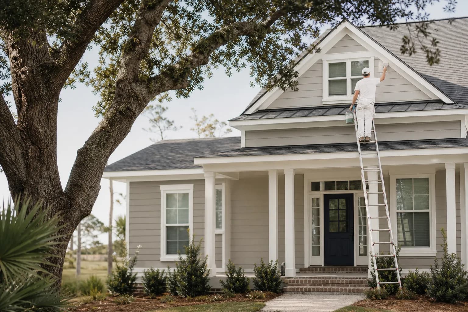
- Body — the dominant color on your main siding. It's the largest surface and sets the whole mood of the house. Everything else answers to it.
- Trim — the framing color. It outlines the eaves, fascia, soffits, window and door casings, columns, porch posts, and railings. Good trim draws the lines of the house and makes the architecture crisp.
- Accent — one bold color reserved for a small, high-visibility element, almost always the front door (sometimes shutters or a porch ceiling). It's the personality, the thing people remember.
The reason three works — and four or five usually doesn't — is that the eye wants a clear hierarchy: one main thing, one supporting thing, one surprise. Add a fourth competing color and the facade fragments; the eye can't find where to land. Your fixed materials matter here too: a brick base, a stone column, and the roof all read as part of the palette, so three paint colors plus those materials is already a full composition.
The 60/30/10 proportions that keep it balanced
Picking three colors is only half of it. How much of each you use is what separates a balanced home from a busy one. A reliable starting point borrowed from interior design works just as well outside: roughly 60/30/10.
| Role | Share of the look | Where it lives |
|---|---|---|
| Body | ~60% | Main siding — the dominant surface and overall mood |
| Trim | ~30% | Fascia, eaves, soffits, window and door casings, columns, railings |
| Accent | ~10% | Front door, shutters, or a porch ceiling — one concentrated pop |
Treat those numbers as a feel, not a measurement — you're not calculating square footage. The point is the hierarchy: the body clearly dominates, the trim does an obvious supporting job around the edges, and the accent stays small and deliberate. The most common way homeowners get this wrong is letting the accent grow — a bold color on the door and the shutters and the garage and the porch ceiling stops being an accent and starts competing with the body. Keep the spark concentrated and it stays powerful.
Contrast between body and trim is the other dial. Higher contrast — crisp white trim on a mid-tone body, or dark trim on a light body — makes the architecture pop and feels fresh and current. Lower contrast — trim just a shade or two off the body — reads softer, calmer, and more traditional. Both work; just choose on purpose.
How to build your body, trim, and accent — in order
The order you choose the three colors matters as much as the colors themselves. Work from the biggest, most committal surface down to the smallest, most flexible one.
Choose the body color first
Pick the dominant siding color — it covers the most surface and sets the mood, so decide it before anything else and let trim and accent follow it.Pick a trim color that frames the body
Choose a trim that clearly contrasts the body without clashing — a crisp white or cream against a mid-tone body, or a deep trim against a light body — to outline eaves, casings, and columns.Reserve one accent for the entry
Pick a single bold color for the smallest high-visibility element, almost always the front door, to draw the eye and add personality.Hold the 60/30/10 proportions
Aim for roughly 60% body, 30% trim, and 10% accent so the body dominates, the trim supports, and the accent stays a small deliberate spark.Test the scheme on the real house
Paint large swatches of all three colors on the actual exterior and view them together morning, midday, and evening before committing.
Body first is the rule because it's the hardest color to change your mind on and it anchors everything else. Once the body is set, the trim has a job: frame it. Then the accent gets to be fun, because one bold color against a well-behaved body and trim lands as confident, never chaotic. A deep navy or forest-green door against a greige body and white trim is a Gulf Coast classic for a reason. For more ideas on that framing color specifically, see our exterior trim color ideas for coastal homes.
Test the three together in real Gulf Coast light
A scheme that looks balanced on three little chips fanned out on the kitchen table can fall apart on a sunlit wall. Exterior light is far brighter than any room and it shifts all day, and our intense coastal sun and bright sky pull colors lighter and cooler than they look indoors — which can flatten the contrast you were counting on between body and trim. So always test the three colors together, in big swatches, on the actual house, and look at them in morning, midday, and evening light before you commit. How that light moves across your specific elevation is its own subject — our guide on how coastal light changes exterior paint colors goes deeper.
The fastest way to preview a whole scheme before buying a single sample is our free AI color visualizer — upload a photo of your home and paint body, trim, and accent right onto it to see the proportions and contrast on your own walls. It's the easiest way to catch an accent that's too loud or a contrast that's too soft before it's on the house.
Get your three colors right the first time
The three-color exterior rule isn't a constraint — it's the structure that makes a home look composed instead of accidental. Give the body the dominant role, let the trim frame it at roughly a third of the look, and reserve one concentrated accent for the entry. Hold those 60/30/10 proportions, choose your contrast on purpose, and test the trio in real light, and you'll land a scheme with genuine curb appeal.
When you want help building the palette, that's what color consultation is for — we'll work through your body, trim, and accent together so they balance on your home. And our exterior painting service handles the prep and finish that make a coordinated scheme last in our climate, from the free estimate through the final inspection, backed by a 3-year workmanship warranty. For the bigger picture on painting the outside of a coastal home, start with our exterior house painting guide for Mobile and Baldwin County. Call us for a free in-home estimate when you're ready to get the colors right. Payment is accepted by Cash, Check, or Credit Card.